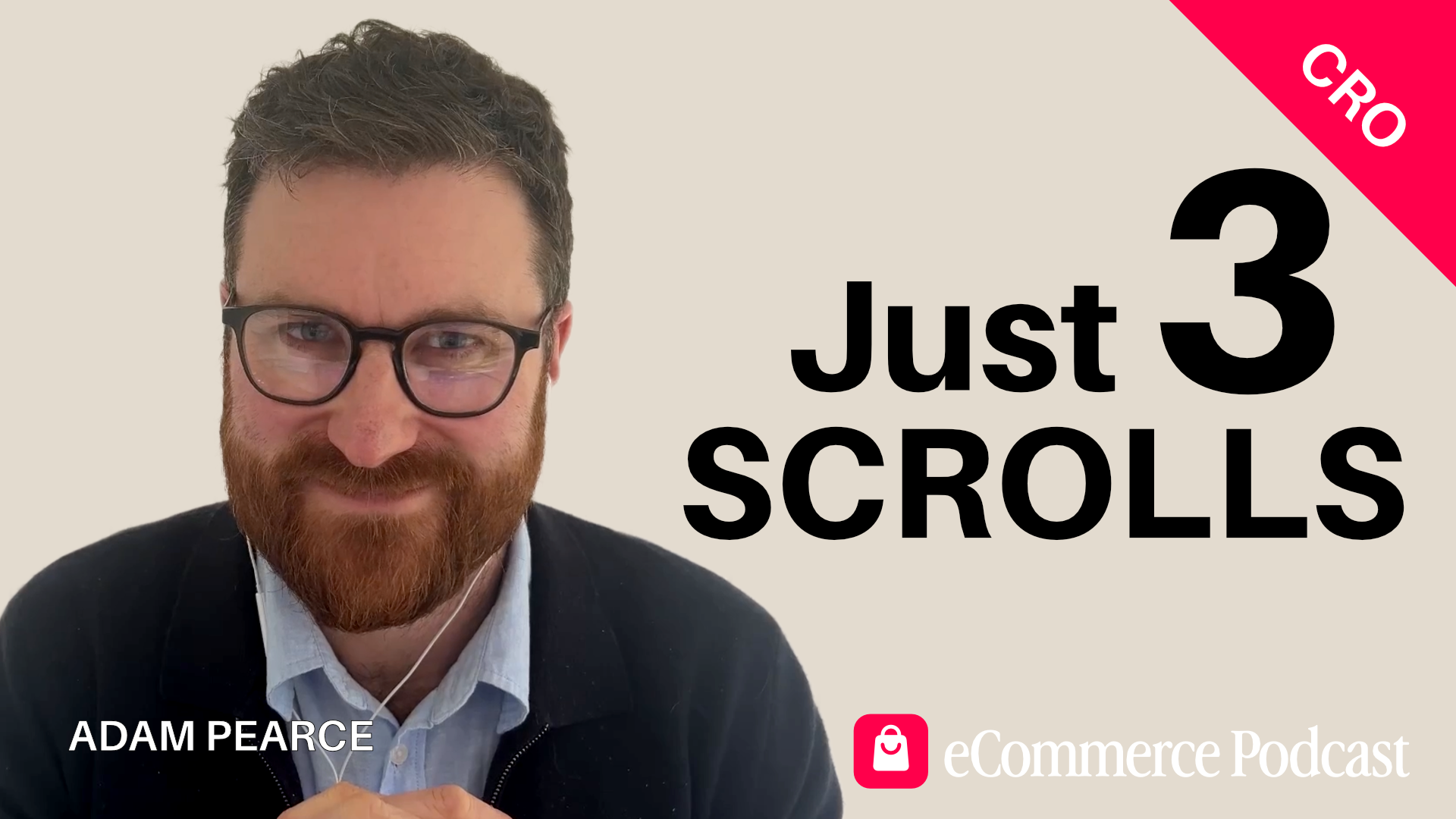
You Get Three Thumb Scrolls Before They Buy or Leave
Adam Pearce has optimised hundreds of Shopify stores. Most of them were losing sales in the same place — the first three scrolls on mobile. In this conversation, he shares the simple changes that consistently lift conversion rates by 30-50%, including the one search bar tweak every mobile site should steal and the two trust signals that boosted one client's sales by 34%. Adam is the co-founder of BlendCommerce, a Shopify CRO agency, and runs eCom Collab Club, a monthly ecommerce event in London.
Between 23 and 30 percent. That's how much of a product page the average mobile shopper sees before they either buy or leave. Not half. Not most. Less than a third. Adam Pearce has spent years watching this happen across hundreds of Shopify stores — and most of them were losing sales in exactly the same place.
Adam is the co-founder of BlendCommerce, a Shopify CRO agency, and also runs eCom Collab Club, a monthly ecommerce event in London. His team exists to answer one question we should all think about: how do we get people to buy now, buy more, or buy again? And the answer, more often than not, starts with mobile — and with what's happening in those first three thumb scrolls.
The Desktop Trap Most Brands Fall Into
Most ecommerce websites are reviewed on desktop. Presented on desktop. Signed off on desktop. There's a good reason for that — it's easier to see everything at once, the visuals look better, and the layout feels more considered.
The problem is that somewhere between 60 and 90 percent of traffic and revenue comes from mobile. So the site that impresses in the boardroom is being experienced on a phone, on the bus, with a thumb, in about three scrolls.
"The real estate that you've got to play with is a lot less than what you obviously have on desktop," Adam explains. "And the way that people make decisions on mobile is very different to desktop."
Mobile shoppers are impatient. They're making snap decisions. And unlike desktop, where someone might open tabs, compare options, and sit with a purchase, mobile is often a case of decide now or leave. Understanding that changes how you build everything.
The Search Bar That's Hiding in Plain Sight
Go to most ecommerce websites on your phone and look for the search function. You'll probably find a small magnifying glass icon, tucked somewhere in the top corner. You might miss it entirely. And if you've got, as Adam puts it, "fat thumbs and poor eyesight," it's not a great combination.
For the past couple of years, Blend Commerce has run a simple test that exposes the search bar on mobile. Not a hidden icon — a visible bar that's there when the page loads. The impact is consistent. Conversion rate increases of 30 to 50 percent, just from that one change.
It works even with a small product range. Adam shares the example of a crisp (potato chips) brand in the US with just eight SKUs. When search was exposed on mobile, customers started using it — not just to find products, but to search for "ingredients." That told the team that the ingredient information wasn't easy to find and was buried in a block of text rather than in an accessible format. Both problems were fixable. One change opened the door to understanding how customers actually navigate the site.
The broader principle here is that people are lazy. Not in a negative sense — just in the way that every one of us, given the option between effort and ease, chooses ease. Amazon's Rufus AI assistant has taken off precisely because people would rather ask a question than scroll through a page looking for an answer. Making search visible is making it easy. Making it easy makes people buy.
The 30 Percent Rule That Changes Everything
Using heat-mapping tools like Microsoft Clarity, Adam's team can see exactly how much of a mobile product page a visitor views before they take action. On average, between 23 and 30 percent of the page. That's it. After that point, they've either bought or they've gone.
Think about what most brands put at the bottom of their product pages — style-with suggestions, people-also-bought sections, lengthy specifications, multiple paragraphs of brand story. All carefully written. All largely unseen.
"People will agonise about all these wonderful sections," Adam says. "But a lot of the time, they've kind of made their mind up already."
So what should you do with that information? His answer is practical. Simply put, whatever you do, the top 30 percent of every mobile product page is where the focus should go. Every element competing for space in those three scrolls needs to earn its place.
That means thinking carefully about what's above the fold on mobile — the main image, the product name, the price, the call to action. And it means rethinking everything below it. Not removing it, but restructuring it so it doesn't create unnecessary scroll in a space that's already tight.
Accordion Menus Aren't Friction — They're Signposts
There's a common objection in CRO circles to accordion menus and tabbed content. The argument is that every additional click is friction. Every step between the customer and the buy button is a risk. Keep everything visible, keep it accessible, and reduce the clicks.
Adam disagrees.
"Friction is about stopping something. It's stopping someone from doing something. With tabs and accordion menus, you're not actually stopping someone. You are enabling someone to more quickly find the information they want."
The alternative — long scrolling blocks of product description, specification tables, ingredient lists — creates a different kind of problem. It pushes the add-to-cart button further down the page. It makes information harder to scan. And in a three-scroll window, it can mean the most important content never gets seen.
Switching to accordions or tabs doesn't hide information. It signposts it. Customers can see what's there, choose what matters to them, and find it quickly. Think of it like base camp on a mountain climb — structured stopping points that help someone decide whether to go further, rather than asking them to commit to Everest from the bottom in one go.
The Trust Signals That Lifted Sales by 34 Percent
Blend Commerce worked with a car parts brand that had a beautifully designed site. Their "About" page was full of compelling reasons to buy — made in the USA, quality assurances, brand heritage. Their product pages had none of it.
The team surveyed the brand's top LTV customers to find out what brought them back. They discovered that a a 90-day returns policy and a one-year warranty was mentioned time and again, yet neither was mentioned on the product page.
So they added both and positioned them directly below the add-to-cart button.
The result was a 15 percent increase in conversion rate and a 34 percent increase in average order value from that single change.
It's a small thing. But it matters for a reason that connects directly to the mobile shopping context. In that three-scroll window, with a fast decision being made and limited time to think, trust signals do the heavy lifting that a longer considered purchase might have handled through research.
The lesson isn't specific to car parts. For any brand where purchase hesitation exists — and it does almost everywhere — the question is what are our best customers actually worried about? And is that information visible in the moment they need it most?
What Else Consistently Works
Beyond the headline findings, a few other changes recur in Adam's work.
The sticky add-to-cart button. This one is non-negotiable. If someone has to scroll back up or down to find the buy button, you are losing sales. It should be visible at all times — and whether it sits at the top or the bottom of the screen is worth testing, but its presence isn't optional.
Instagram-style navigation circles. Rather than a hamburger menu that opens to a long, text-only list of categories, having four or five top collections represented as visual circles at the top of the page — in the style of Instagram Stories — gives immediate visual signposting. Adam's team has found this works on desktop too, not just mobile, because it adds a visual element to what's usually a functional but uninspiring part of the site.
Image and video thumbnails instead of dots. Most product pages on mobile display the main image with a row of dots beneath it, indicating that more images are available. Replacing those dots with small thumbnails — showing the product in use, in context, in different settings — means customers can see at a glance that there's more to discover. They don't have to swipe to find out.
On-site quizzes for the right categories. For supplements, vitamins, beauty products, food, or anything where the customer might feel uncertain about what they need or how much to take, a structured quiz that guides them to the right product can work well. The secondary benefit is the data — every answer feeds back into segmented email flows, so the welcome sequence a customer receives is built around what they actually told you.
Knowing Your North Star
Before you can measure anything, you need to know what you're measuring towards.
"Decide what that number is. I can't literally say enough, because so many people say, 'we want to grow the business.' That isn't enough. What is the number you need to get to?"
GA4, Shopify Analytics, and a heat-mapping tool like Microsoft Clarity will tell you almost everything you need to know about what's happening on site — where people are going, what they're clicking, when they're leaving, and how the numbers stack up against your goal. But without a clear target, those numbers don't tell you much.
Start with the goal. Work backwards. Then use the data to find the gap between where you are and where you need to be. That's the frame that makes CRO useful rather than just interesting.
Full Episode Transcript
Read the complete, unedited conversation between Matt and Adam Pearce from Blend Commerce. This transcript provides the full context and details discussed in the episode.
Full Episode Transcript
Read the complete, unedited conversation between Matt and Adam Pearce from Blend Commerce. This transcript provides the full context and details discussed in the episode.
Matt Edmundson (00:04)
Welcome to the eCommerce podcast. My name is Matt Edmundson and it is great to be with you on this beautiful day talking about all things eCommerce and to help me do that, Adam Pearce is back on the show. Adam, I was looking just at my notes then. September 2022 was when our last episode. Can you believe that?
Adam Pearce (00:22)
Wow. I mean, I've put on weight, I've lost weight. I've had children since then. I mean, it's all changed. And eCommerce has maybe had a few changes as well.
Matt Edmundson (00:35)
Well, possibly. Yes, it has. I had a few. For those of you listening to the show that either don't know you because they've not listened to your podcast, which they should obviously listen to, or because they don't remember back to 2022, just give us a quick snippet about your good self.
Adam Pearce (00:36)
Absolutely. So I am one of the co-founders at Blend Commerce, the Shopify CRO agency. So ultimately we spend our day looking at eCommerce sites and saying, how do we get people to either buy now, buy more or buy again? And alongside that, I also run an eCommerce event called eCom Collab Club, which some of you may have seen and heard me talking about, which runs once a month in London.
Matt Edmundson (01:17)
Fantastic. Is there a website they can go to to find out more about that?
Adam Pearce (01:23)
The website is terrible, which is a great thing for an agency guy to be saying about one of the things that he owns — cobbler's shoes and all that. If you have a look on LinkedIn, you can find eCom Collab Club on there and all the details are right there. Yeah, the website is coming, shall we say.
Matt Edmundson (01:30)
It's en route. It's like the builder's house — that's never the house you should look at. It's totally the case that you should never look at our own websites. They're always the worst because they're always the last ones to get done, aren't they? You're too busy working on everybody else's stuff to get your own stuff done. It's quite funny. I was talking to someone earlier on, having a coaching call, and the team can hear me when I'm doing these calls because we're in an open plan office.
Adam Pearce (01:41)
Yes, exactly. I'm glad you're backing me up on this one, Matt. Exactly.
Matt Edmundson (02:09)
You can see me scribbling notes as you're talking — like, we've not done that yet, we should probably do that. It's quite funny, isn't it? And CRO, for those that might not know, just explain what that means.
Adam Pearce (02:22)
Yeah, sure. So conversion rate optimisation is effectively the process of looking at what visitors do and don't do on your site, and then trying to improve the overall revenue of a business by influencing your conversion rate, your average order value, and your repeat purchase rate to get the amount of money coming onto your site increasing.
It just effectively takes things a step further and says, look, I think we should change our website to make it look nicer, to look better. I think we should change our website because we can see that 75% of anyone that comes onto the site doesn't click here, they click there and they typically leave the site. So it's using a blend of psychology with data and technical knowledge to be able to make those changes on the site to get people to buy.
Matt Edmundson (03:22)
Fantastic. I love this buy now, buy more, buy again. It's quite catchy and I think it works because I was always told, even before eCommerce, I remember sitting in a business seminar with a guy called Jay Abraham. This is old school. Some people will remember his name from the 80s and 90s and he said there's only three ways to grow a company. You increase the number of customers, you increase average order value and you increase average order count. And so when I read buy now, buy more, buy again, I'm reading more customers, average order value increase and average order count increase. But you've been much more succinct and I like that.
Adam Pearce (03:55)
Absolutely. Yeah, I mean, anyone listening to this — us included — we have it with our own businesses, don't we? Ultimately, the first time a potential client comes to the site, you want them to book a call or buy one of your services. If they're an existing client, you want them to do more with you, or if you've done a project with them, come back again. It's exactly the same for eCommerce brands, but different eCommerce brands will be able to pull one or more of those levers at different times. And I think this is the real crux of getting started with CRO — to work out whether it's buy now, buy more, or buy again that really is the lever you can pull to try and increase the revenue.
Matt Edmundson (04:30)
Fantastic. Well, you've obviously got some experience here, Adam, in this whole topic, and a client or two as well. If you had a magic wand and you could wave said magic wand and solve the most common problem that your clients experience on their websites, what would that be?
Adam Pearce (05:06)
This still today tends to be around the mobile experience. Now, anyone who has sat in a meeting about a website, I guarantee that nine times out of ten, when that website is shown to you — whether that is a PDF with the website itself — it will be in desktop view. Most eCommerce brands are getting somewhere between 60 to 90% of their traffic, and typically revenue as well, from mobile.
So a lot of the time the crux of the matter is usually around mobile experience. And that is because desktop designs hardly ever automatically translate to a good mobile experience. And ultimately the way you've got to think about this is that the real estate that you've got to play with is a lot less than what you obviously have on desktop. Secondly, the way that people make decisions on mobile is very different to desktop.
Now, one of the things — let's look at a specific example. If you go to most eCommerce websites and you look for search, you will probably have to either do a bit of digging around for it, or you will see a little magnifying glass icon in the top right-hand corner. Now, if you think about that in terms of having to search for a search feature, that's a pain. And secondly, if it's a little magnifying glass, if you've got fat thumbs like me and poor eyesight, not a great combination.
So we have, over the past couple of years, for many sites, done a test where we expose search on mobile. What does that mean? It means that we have a bar on mobile that is visible all the time, where people can clearly search for the product they're looking for. When we do that test and implement it, conversion rate can go up from anywhere between 30 to 50% just by doing that. And because so much traffic is going through mobile, that is always one that works very well. So mobile generally, but that particular item of exposing search on mobile always, always works.
Matt Edmundson (07:17)
That's really interesting. Because you're right, you don't see it that much on mobile, do you? You've all got to find that little magnifying glass. I'm curious, have you found that true regardless — like if you've got a site selling 10 or 20 products versus a site selling 500 products, is that still true?
Adam Pearce (07:36)
Yeah, it's a good point actually. So we have a crisp, or potato chip, company in the US that we work with. They only have eight SKUs. What we were finding was that when people were on mobile, they were actually navigating a bit. And what we found is that when they were using search on mobile, they were doing two things. One is they were putting the product into the search feature and they were then adding the word "ingredients" to it.
So there were two things that we noticed. One is that the ingredients information wasn't being displayed in a way that was working for the customer, and we realised that because we could see it was in a large block of text. So first of all, we changed the format so it became an accordion menu so you could clearly see where the ingredients were. The second thing was that when we actually exposed search on mobile, people were then searching for bundles and subscriptions as well.
Matt Edmundson (08:14)
Yeah.
Adam Pearce (08:34)
So all of the things they were looking for off the back of it were then dictating what we could do on site as tests. And although we'll have a small amount of SKUs equally, inherently we are lazy as anything. If you think about Amazon at the moment, everyone would have noticed Rufus is now around. Rufus is an AI chat that allows you to search for key information about the product. That has gone through the roof in its usage because people are like, you know what, I need to find the information that I care about now. So if I am buying my daughter's new Iron Man toy, I'm going to ask it, will this fit my four year old daughter? I'm not going to scroll through information because I'm lazy and I've got used to this mode where I expect every website to be catered completely for me. The same logic applies — it doesn't really matter how big your SKU count is.
Matt Edmundson (09:26)
Yeah.
Adam Pearce (09:32)
Allowing people to be lazy will help you buy more, buy again.
Matt Edmundson (09:37)
Allow people to be lazy. That's a really interesting way of putting it. You said — if I can just back up a little sec — you said that people make decisions differently on mobile than they do on desktop. What do you mean though?
Adam Pearce (09:53)
So with mobile experience, what tends to be the case is that a lot of the traffic that goes to mobile will always be going to the product page. Generally with traffic these days anyway, not many people tend to navigate away from the product page. You might get a bit of clicking around on collection pages, but in terms of the rest of the site, fairly limited.
From the point of view of mobile, when you are shopping, in that particular moment you've got, generally speaking, two and a half to three thumb scrolls as an absolute maximum. After that point, that person is either buying or moving away from the site. So what this means is that the patience people have on mobile will be a lot less, and the time they have to shop
Matt Edmundson (10:49)
Yeah.
Adam Pearce (10:51)
is generally a lot less. And therefore the ability to make snap decisions is also going to be a lot more pertinent than it would be maybe on desktop. Equally, a lot of people that are tracking their sessions across multiple devices will always see this. Typically you're going to get between two to three devices involved in every single transaction. There are not many transactions now for most eCommerce brands
Matt Edmundson (11:02)
Yeah.
Adam Pearce (11:19)
where it's a pure, straightforward case of: I'm going onto Google, I'm searching for a product, I'm buying the product. It just isn't a feature of the way that people shop these days. And especially now that ChatGPT is in the mix, you will see people bouncing around to those different sources before they actually purchase.
Matt Edmundson (11:39)
Yeah, it's interesting. Despite previous protestations, ChatGPT are now going to do paid ads.
Adam Pearce (11:49)
Yeah. What's interesting is that Claude has come out and said they absolutely are not. So I think that's where these LLMs are going to start differentiating from one another.
I have a lot of problems with ads on LLMs. It is definitely going to change, I think, the world that I'm in — which is CRO — because what the front end of a site will need to do will need to be even more concise. And I think equally the recommendations that are being made and the way in which they're being made will also have an impact. Because ultimately, if we are being shown results that we've been told are sponsored, I don't know necessarily whether that is going to work for them or not. And secondly, if we get to a position where research results aren't disclosing that they're influenced by ChatGPT and the models they use, that is, I think, from a trust point of view, very problematic. Sam Altman has come out and said
Matt Edmundson (12:47)
Mm.
Adam Pearce (13:02)
it is going to be very clear when you get sponsored ads, sponsored results. But yeah, it's all about trust, isn't it? And we do put a lot of trust into these tools — me included. I share a hell of a lot of personal stuff with ChatGPT. Probably share far too much about the business as well that I shouldn't. And I think a lot of people are guilty of that. So yeah, it's interesting on the moral compass front.
Matt Edmundson (13:12)
It is. Watch this space, as they say. Let me go back to mobile if I can before we get totally sidetracked, because I really want to go down the AI rabbit hole, but let's stick with mobile a little bit. Is it still the case, Adam, that conversion rates are higher on desktop than mobile, or has that changed as well?
Adam Pearce (13:32)
I would say actually that for a majority of cases now, conversion rates are kind of on par in terms of desktop and mobile. Particularly when it comes to beauty, vitamins and supplements, subscriptions like dog food — they're pretty much there or thereabouts. I think when it is a more considered purchase, the conversion rate on mobile tends to be a lot less,
Matt Edmundson (13:59)
Mm.
Adam Pearce (14:21)
purely because of the fact that if you are generally spending above £150, that's when you start to see that kind of gap come out between the two.
Matt Edmundson (14:31)
Yeah, it's interesting how it's levelled out. What do you think about the idea of mobile apps? Years ago when mobile apps became a thing, everybody in eCommerce was like, I need a mobile app. Then all the developers went, actually no, you just need a web app — you just need your website to work on mobile — because mobile apps are notoriously expensive and difficult to maintain. Technology has once again changed and getting these kinds of things seems to be a lot easier now. What are your thoughts about mobile apps? Should I be thinking about that as an eCommerce brand?
Adam Pearce (15:16)
I think you should be, but I think there are specific contexts and it depends on how you use it. When it comes to a mobile app, the benefit you've got generally is around the push notifications that you can use off the back of that — having that ability to not pay Zuckerberg or anyone else money to advertise to someone on their mobile phone. The difficult thing, though, and I think a lot of brands slip up with this, is that when they go and do that, there isn't actually any benefit to the customer for downloading the app versus using mobile. There might be a 10% discount off the first purchase, but ultimately that's not going to lead to any longevity.
I think if you are using a mobile app, there are two things you need to do. Number one is tie it into your loyalty programme if you have one, so that the more you use the app,
Matt Edmundson (15:51)
Yeah.
Adam Pearce (16:12)
the more loyalty points you get or the more benefits you have. And if you're really smart, you can have the mobile app administer some form of membership. A lot of brands now are doing memberships where you're paying a monthly amount and getting certain benefits — free shipping, content, access to events, exclusive product drops. If you're delivering that through the mobile
Matt Edmundson (16:24)
Yeah.
Adam Pearce (16:41)
app, where there is a real use case for downloading it, that's worthwhile. But if you are purely using the mobile app as effectively the same experience as the mobile version of the site, that's completely a waste of time. And I think the other thing is that, with everything in eCommerce — and I feel very passionately about this — don't have it as a silo. If you are going to use a mobile app,
Matt Edmundson (16:57)
Yeah.
Adam Pearce (17:11)
it should be connected to your email marketing provider. It should be connected to WhatsApp. It should allow you to use all of the features and functionality that you would expect to see on mobile in an app — because otherwise, what is the point?
Matt Edmundson (17:29)
Who do you think is doing it well then in that space?
Adam Pearce (17:32)
In terms of brands using apps well, I think Beauty Pie are doing this pretty well. Because what they allow you to do is manage your subscription through the app, which is number one and very important. Secondly, they do exclusive drops through their app, which is again pretty useful.
Matt Edmundson (17:34)
Yeah.
Adam Pearce (17:59)
So I think they're a pretty decent one to look at. I think the thing with apps as well is about not making it too complicated or convoluted. Six or seven years ago, people were spending 40 or 50 grand on developing a customer app. And now there is no logic in my mind for why you would go and do that.
Matt Edmundson (18:05)
Yeah.
Adam Pearce (18:27)
You've got some great providers out there like Shopney, for example, who you can effectively build your own app with — lots of integrations with the tech that people use on Shopify sites — and relatively inexpensive per month. So it's also about making sure you're using tech that is fit for purpose but also means you are not sinking loads more OPEX or CAPEX into a company that you don't need to.
Matt Edmundson (18:57)
Yeah. It's interesting. Listening to you talk, I'm thinking about how I would design an app for one of my own eCommerce businesses versus what we do on the website. I can add some features, but the actual principles are the same, aren't they? It's not like I can just go to a mobile app and have way more scrolling because they're on an app. The design principles are still the same. So if I'm listening to this and you want to wave your magic wand and solve everybody's mobile commerce problems, what are some of the key principles I need to think about when it comes to the UI? What are some of the common mistakes we're making and how do we fix them?
Adam Pearce (19:54)
So let's talk about a couple of different ones that tend to happen quite a lot. The biggest one for me, typically, is when you're talking about information on product pages. Whether that is the product description, the ingredients, the materials it's made from — a lot of the time, because desktop allows for it, these tend to be in large blocks of content — paragraphs or multiple blocks. That visually looks appealing on desktop, and you don't necessarily need to have too much scroll from a product page point of view. But those blocks hardly ever come across well on mobile. You should look at changing them to accordions that allow people to drop down, changing some of the text to iconography — that's also a good tip to reduce the scroll — or going down the tabular route,
which can also work so that people can self-select the information they want. Now, some people listening to this will say, look, in eCommerce the whole thing is about reducing friction. So why would you add in more clicks with a tab or with an accordion menu? But when we think about what friction actually means — friction is about stopping something. It's stopping someone from doing something. With tabs
and accordion menus displaying information, you're not actually stopping someone. You are enabling someone to more quickly find the information they want. Because if you have a long scroll of two or three pages to get down to a product description, they might not be able to find the information, and secondly that is a long way to get to the add to cart button. So I don't subscribe to the view that if you are changing the format of information so that you have to click to get to it, it's hiding it — because you are signposting that person to it.
So that's the first one. The second one is also about having a sticky add-to-cart button, or a call to action button that is visible at all times. A lot of the time what will happen on mobile is that there will be a buy now button at either the top or the bottom of the page, and as someone scrolling through lots of information, they are then having to cycle back to try and get to that buy now button. We're talking about seconds here, but like I said earlier, people are lazy. We need to give them the ability to transact in the quickest way possible.
So those are two things that are very much key. The third one is that people talk about your USP, your key value proposition, whatever you want to call it.
Matt Edmundson (22:30)
Yeah.
Adam Pearce (22:46)
And there's a really good example here of a brand that we work with. They're actually a car parts manufacturer. They came to us with a beautiful site — it was great. And they had this About page which said all the fantastic things about the company. But on the product page, none of that was there. There was no "made in the USA" iconography, none of that kind of stuff. So we brought that onto the product pages and that made a really good difference.
Then the other thing was that below the call to action there was a generic piece of copy — you know, "buy now from your favourite automotive provider" or something a bit naff like that. We said, we're not really using that to its best ability. So we surveyed their top LTV customers: ultimately, guys, what's the thing that keeps you coming back? And they mentioned two things. One was a 90-day returns policy.
Matt Edmundson (23:39)
Mm.
Adam Pearce (23:44)
And the other was a one-year warranty. So what we did is we put those two things below the call to action button. What we saw was a 15% increase in conversion rate and a 34% increase in average order value, isolated to just that particular test. So it's those small things that you can do very easily. Calling out those things invokes trust in that very quick mobile shopping experience. These are some of the things that can put you in a much better position.
Matt Edmundson (24:26)
That's really powerful. There's so much there, Adam. So I've made lots of notes and I want to go through them one by one. Going back to the tabs on the mobile device — if you have a tab or an accordion which people click, do you track how many people actually click those?
Adam Pearce (24:30)
Yes. We can see the activity in a couple of ways. We can use GA4 for that because we can put events on each of those elements. But equally, a lot of the time we will use a heat mapping tool. Typically Microsoft Clarity, which is free to use — that's going to show you the areas of your site where people are clicking and aren't clicking. And secondly, it's going to track people through the site when they do interact with those items. So using something like that to understand the behaviour is pretty important.
Matt Edmundson (25:25)
What are some of the things that have come out of that exercise that surprised you? That you've seen on customer websites?
Adam Pearce (25:31)
I think one of the things that still surprises me is how little of a mobile product page people get down before they purchase. On average, we see between 23 to 30% of that page is viewed before they will buy or leave. So, less than a third of the page has been viewed
Matt Edmundson (25:46)
Mm.
Adam Pearce (26:02)
before someone has made the decision. People will agonise about all these wonderful sections — style it with, people also bought. But a lot of the time, they've kind of made their mind up already. So even if you are going to take a fairly relaxed approach, you should look at your website and say the top 30%
Matt Edmundson (26:04)
Yeah.
Adam Pearce (26:30)
of every single mobile page — that's where the love is going to go. That's where the focus is going to be. That is what you should be doing in my opinion, because we see it time and time again.
Matt Edmundson (26:41)
So the question that comes into my head, Adam, off the back of that — let's say my page is 100 lines long, just because 100 is easy for maths. People see 30 lines, and then that's it — they've either made their decision to buy or they're out. So I've got 70 lines. Do I put that 70 lines of content behind an accordion so everything then fits into the 30 lines? And if I do that, is it a case of, well, they're only viewing the top 30% so now they're only viewing the first 10 lines — or are they still viewing all of it because I've made it smaller?
Adam Pearce (27:23)
Yeah. So in that scenario, what you're using is a signpost — that's going to mean people will know what their next natural step is. If you think about that example again: you've got a hundred lines and you're focused on that first 30. If that's effectively just a block of text, there isn't really anything within that space that allows people to take a next step other than the call to action button — that's the only route they can go. But if we've restructured things so the primary content stays at the top of the page, we are now allowing people to look through multiple videos of that product, we are giving people three different tabs to click on. We've already given four or five more options than they had before, which was either click the buy now button or move on. It's kind of like climbing a mountain — you stop at different
points. That's what we're doing on the mobile product page. You get to base camp and then you make that decision to go further. Ultimately, if you don't have those things on site, you're asking someone to climb Everest from the bottom right to the top in one go. And it just ain't going to happen.
Matt Edmundson (28:40)
It's really interesting. So the sticky call to action button which you mentioned as your second thing — does that go at the top of the screen or the bottom of the screen, or does it not matter?
Adam Pearce (28:45)
I'm going to sit on the fence and be Switzerland about this, but ultimately it depends. We do this a lot where we'll run a test for a couple of weeks to work it out. It's exactly the same as when the cookie banners came in that we all love and adore. We tested it with all of our clients — we did pop-up, top bar, bottom bar.
Matt Edmundson (28:56)
Yes.
Adam Pearce (29:16)
I think with the cookie banner, a lot of the time the bottom bar was the one that allowed people to continue shopping most easily. But again, we just need to test it — and that's a fairly simple test to do.
Matt Edmundson (29:30)
One of the things that has intrigued me about Apple's new iOS. Are you an Apple man or an Android man?
Adam Pearce (29:35)
Apple, I am indeed.
Matt Edmundson (29:57)
So you will have experienced this, Adam. I'm on their new iOS update and my default is to go to the top where things used to be, and they've shifted everything down to the bottom, which intuitively I suppose makes more sense. I get slightly thrown because I expect it all to be at the top where it's been for years. But that intrigues me — Apple have done quite a big shift in this update. The search bars, the buttons, everything are now at the bottom of the screen versus at the top. I don't know if you've noticed that.
Adam Pearce (30:08)
Yeah, we have noticed it happening, but we haven't seen any direct correlation with the iPhone traffic on client sites and the behaviours. The thing that will be interesting is whether there is any change in the data as that rollout has happened in the US
Matt Edmundson (30:22)
Mm.
Adam Pearce (30:36)
into Europe and beyond — obviously there have been staggered rollouts for different user groups. It's not something I can say has made an impact yet, but it wouldn't surprise me if there is — maybe not so much a fall in conversion rates or average order value, but I would imagine dwell time might be longer and potentially page exit might be higher in some instances while people are getting used to it.
It's a really interesting point because, with all the will in the world, you can do what you like to that product page, but if the device or browser says otherwise, you will get a different experience. I mean, the days when
Matt Edmundson (31:09)
Mm.
Adam Pearce (31:31)
we still had Internet Explorer around and Edge and all that. Something would look absolutely stunning in Chrome, and then you'd put it onto Edge and be like, what on earth is this? So it's the same scenario, I guess.
Matt Edmundson (31:43)
Yeah, no, I think you're right. I think it's interesting that they did that just from a UI point of view, and I wonder whether we'll see that follow through onto websites as well. When you were talking about the car parts company, you said you surveyed your top LTV customers. How important is it to do that?
Adam Pearce (32:01)
I think when you get to a point where you've said — and I hate using the word best practice, but it is what it is — there are certain things that just work for most people. Once you've moved past that and you've done a considerable period of testing with the data you have, it's then that you need to move on to qualitative. In an ideal scenario, you would go and ask those customers first, but
in terms of doing that, the cost is higher because it's more man hours. Yes, you can send surveys by email, but we all know surveys rarely get fully completed. We get about 12 to 15% completion, which is not great. And equally, from a CRO point of view, a lot of the time it's a fairly new concept in most businesses, so saying you want to go and speak to customers can be met with resistance at first. But once you've got past that initial stage, going out to customers is really important.
But before you get to the point of big surveys, at an absolute minimum, NPS — net promoter scores — put that at the end of a purchase. All that is doing is a very short survey. Once that person has put their credit card details in and purchased, it says effectively: how was it shopping with us today? Can you answer a couple of questions? You will get so many golden nuggets from doing that. The amount of times that people are not doing this absolutely astounds me. Because the two things with NPS scores are: number one, you can use it for the original intention — what do people actually think about the site? But secondly,
Matt Edmundson (33:36)
Mm.
Adam Pearce (34:03)
you can also make sure that if someone has had a great experience, you tie that in with your review process. So if someone has a great experience, you send them directly, at that moment, an opportunity to review your store. You can do a lot with that, both from a marketing and a learning point of view. But getting those things that aren't easy to measure the way clicks and views are — there's so much you can find out from that.
Matt Edmundson (34:09)
Yeah.
Adam Pearce (34:30)
It's just about making sure you can find some time to get into that information and use it.
Matt Edmundson (34:35)
Wonderful. That's very helpful. You said there are things that work for most people. What are those?
Adam Pearce (34:43)
So the exposed search on mobile is 100% one that people should be doing. The other one is — if anyone uses Instagram, you'll see at the top you have your stories in these little circles. We call that a story-type sub-collections approach. That's something that's worked very well recently on mobile in the sense that when you get to a mobile site, rather than just having your typical menu at the top or your hamburger menu on the right-hand side, if you have four or five of your top collections at the top represented in a circle with a visual of that area, that is a great signposting tool to get people through. And again, that works time and time again. Because if your search is non-existent or not great on a site, how else are they going to find it? They're going to click on the hamburger menu,
they're going to see a list of categories that probably don't mean too much, then subsections of those categories. There's still no imagery at this point. If I go onto a clothing site and I'm a bit of a jeans fan, I'm going straight to the jeans — I've bypassed all that stuff in the menu. That is working time and time again.
Matt Edmundson (36:03)
And is that — I'm intrigued by this idea of the Instagram story circles. Is that horizontal scrolling or are you literally fixed with four or five categories that fit on the screen? Anything beyond that, you're going to have to search for?
Adam Pearce (36:09)
Yeah. Four or five categories, absolute max. And what's been interesting with this one as well is we've actually tested the same thing on desktop with a coffee brand in the US, and it actually works exactly the same on desktop too, because it gives it a visual element. There's also a way to do this by visualising the mega menu — if you've got the menu at the top and you drop it down, you might see four or five block images of each collection to represent it. That's another way.
But another one along similar lines — if you go to a mobile site, a lot of the time you will see small dots below the main image. So, for example, it might be a sports nutrition brand, they might have a picture of their creatine — just a bag of creatine there.
Matt Edmundson (37:15)
Mm.
Adam Pearce (37:20)
Underneath, the dots are basically saying you've got to scroll across to look at the different images or videos that are there. Replacing those with image or video thumbnails allows someone on mobile to view multiple images or videos all in one view. If you look at just a bag of creatine, which isn't very exciting anyway, but then the other version is a bag of creatine below, and you can see it's in a shaker, you can see someone running with it, you can see there are a couple of videos there — straight away, you've got a visual that there are more things this product does than just that. So that's another thing which is a very simple switch technically but means you are showing more information. Again, people are lazy — they don't want to have to swipe through. They want to see it all quickly, verify it, and go buy.
Matt Edmundson (37:56)
Interesting. So you're showing the main product image still, but you're showing the other images underneath rather than just dots. Wow, okay. But there's a lot to go — don't let me interrupt. Are there more things that are common for most people?
Adam Pearce (38:20)
Yes, underneath in small thumbnails.
Let me think. One of the other things that still works very, very well across all sites is on-site quizzes — and I know a few people listening may be rolling their eyes. But when I say quiz, I'm talking about a structured way to allow people to find the product they're looking for. Now, if you've got a good search feature, I think this becomes less important.
Matt Edmundson (39:02)
Mm.
Adam Pearce (39:03)
But particularly if you have a site where a certain proportion of visitors are not sure whether they need your product, or are worried or concerned about what that product is going to do for them or how much to take — that's important. Supplements, vitamins, food, beauty — anything ingestible — all of those lend themselves to quizzes, because ultimately people will ask: how much do I need, when do I need to take it, what's the benefit going to be for me? So asking things like, for moisturisers, your skin type, your skin tone, what kind of diet you have — all of these things make people more informed. The real beauty for me though, as a marketer, is the data that you get, because all the data stored off the back of that
Matt Edmundson (39:44)
Yeah.
Adam Pearce (40:02)
can then be used in email marketing. So Matt, if you go to a food site and I go to a food site — let's say it's a matcha brand, which is very popular now, for me not so much. Let's say I'm telling you I currently drink eight cups of coffee a day and you're telling it you drink two cups. I love the raspberry flavour. You love lemon. What can happen is that the welcome flow you and I get can be slightly different. It's dynamically created, but the content in yours
Matt Edmundson (40:28)
Mm.
Adam Pearce (40:31)
is about lemon and the suggestion that it might be great to replace your morning coffee with a matcha brand. And for me, it's like, did you know how bad drinking eight cups of coffee a day is? Actually, why not try replacing it with three cups of matcha? That sort of thing just keeps working.
Matt Edmundson (40:43)
Yeah, it just gives you that data, doesn't it? It really does. My last question before we move on to the next segment of the show. The call to action is a sticky button. I see a lot of mobile sites where you go on and you have to scroll to get to the Add to Cart button. Is that a big no-no?
Adam Pearce (40:51)
Yes, absolutely. It needs to be visible at all times.
Matt Edmundson (41:17)
Very good. That was a quick answer. We like that.
Adam Pearce (41:18)
Yeah, it is what it is. The data doesn't lie.
Matt Edmundson (41:22)
It is what it is. Don't argue with the data, dude. And Adam, listen, I'm aware of time so we need to move on to the next segment. This is where I ask you for a question for me. I don't answer it on the show — I answer it on social media. So if you want to find out what my answer to Adam's question is going to be, come find me on LinkedIn. But Adam, what is your question for me?
Adam Pearce (41:46)
I want to ask you, is WhatsApp really going to be the next big thing in eCommerce?
Matt Edmundson (41:56)
Oh, great question. I would love to talk to you more about this, but maybe that's another show. Because I feel like there's a big mountain behind that question. Okay, if you want to know what I think about that, come find me on LinkedIn — Matt Edmundson — and you'll find the answer to that question at some point in the future, no doubt. But Adam, listen, love the conversation, man. If people want to find out more about you, about Blend Commerce, about the events, all that sort of good stuff, where do they go?
Adam Pearce (42:02)
Thank you for having me. If anyone wants to find out more, go to LinkedIn, Adam Pearce — P-E-A-R-C-E — you'll see my face on there talking about Blend Commerce and eCom Collab Club. And if you search for eCom Collab Club on Google, you will get through to a few different pages which will tell you all about what it's about.
Matt Edmundson (42:44)
Fantastic. So go and say hello to Adam. And of course, all of those links will be in the show notes. If you're on a podcast app, just scroll down. If you're on YouTube, just click the description. And if you've signed up to our newsletter, they'll be in your inbox because we always make sure they go in the newsletters when we send them out. So if you've not subscribed to the newsletter, go check it out — I think you will enjoy it. But yeah, Adam, thanks so much for coming on the show, man. Genuinely love the conversation. Before we go,
we like to do this thing right at the end for those that have stayed till the end. We call it saving the best till last. So Adam, you've given us a whole bunch of stuff here to think about. I would love for you to take the next two minutes to riff on how we track data well. Should we all be signed up to Google Analytics, or whatever we're on now? Is there a piece of software you'd recommend? What is your top tip, your top advice on tracking data? The mic is yours, my friend.
Adam Pearce (43:51)
Thank you. So the main thing, first of all, is you need to decide what your ultimate goal — your North Star — is. Whether that is to get to two million pounds a year, whether that is to achieve a 30% profit margin, whether it is to reach five million dollars per quarter, whatever that might be — start there and work backwards. Once you've got that, you need to make sure you've got tools that allow you to track it properly.
A lot of the time, irrespective of what that goal is, that's probably going to be GA4. If you're using Shopify, Shopify Analytics. And equally, in terms of being able to work out what was happening and why, a heat mapping tool like Microsoft Clarity, Hotjar, or Lucky Orange — any of those three will give you what you need.
Because if you ultimately know, for example, that you want to get to one million pounds of revenue in six months' time, GA4 and Shopify Analytics are going to be able to tell you how far away from that you are, and equally what behaviours people are doing that are preventing you from getting there — i.e. what is causing lower average order value, and from a conversion rate point of view, when are they converting and who is converting.
The heat mapping tool is going to show you an overall picture of where people are doing things that go against that buy now, buy more, buy again principle, and equally will allow you to understand the impact that is having on your average order value, conversion rate, and repeat purchase rate.
So I think the critical thing is: decide what that number is. I cannot say it enough, because so many people work with agencies and say, we want to grow the business. That isn't enough. What is the number you need to get to? Once everyone is on the same page on that, the metrics that follow are much more simple.
Matt Edmundson (46:08)
Brilliant. Love that. Adam, let's not leave it as long next time before you're back on the show.
Adam Pearce (46:16)
Great to be on it. Thank you so much for having me. Appreciate it.
Matt Edmundson (46:19)
That's been great. Thank you, Adam. Thank you so much for joining us, ladies and gentlemen. I hope you've enjoyed the show. If you have, make sure you like and subscribe and do all of that good stuff. Do go connect with Adam — the links will be in the show notes. But make sure you stay connected with us because we've got yet more great conversations coming up and I don't want you to miss any of them. That's it from Adam. That's it from myself. Have a phenomenal week wherever you are in the world. I'll see you next time. Bye for now.
Meet your expert
Adam Pearce
Adam Pearce
Blend Commerce
Even more episodes...